REVIEW – KODAK PORTRA 160

Kodak Portra – the least loved of the Portra family – to quote the current hot topic of the day – the royal family ‘Spare’ or sad Harry of Kodak films! But this certainly does not make it an unpopular film.
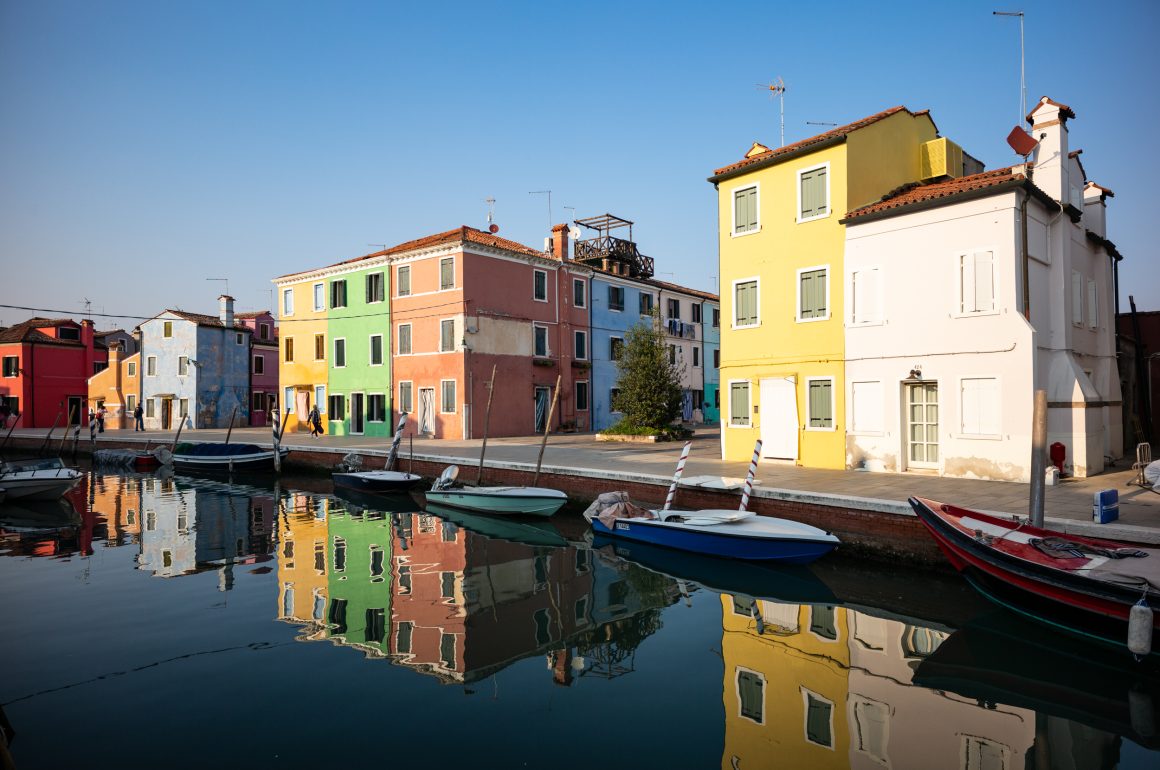
Originally launched in 1998 and available in three speeds, 160, 400 and 800 ISO with the 160 and 400 breaking down further into VC (Vivid Color) and NC (Natural Color) variants – that are sadly no longer available, the current iteration was updated in 2011. The film stock itself is touted to have the sharpest and finest grain of all speeds combined with a muted, almost pastel like color palette.

And this is probably why I really love it, it’s different. Portra 400 is incredibly versatile, its vivid and warm and the even finer grain and Kodak Ektar 100 is richer and punchier, giving you something that lives in the land of 1950’s ice-cream parlors and Wes Anderson films. A soft and nostalgic look that to be honest, is why I was drawn to film in the first place.


The film has a very wide and quite forgiving exposure latitude – it holds up well especially to over-exposure, and if anything that adds to the unique color palette. I have found that shooting it on cloudy and overcast days becomes so subtle and flat, due to its medium contrast and low saturation, that images can become quite gray and muddy. So for me, it’s very much a mixed lighting to sunny daylight film that works wonderfully for landscapes and of course, portraits with its very natural skin tone renditions.


As mentioned above, it’s extremely fine grained, but not without grain. When metered and exposed correctly it still looks like a shot on film (even in 35mm), but has a level of detail that really stands out to other films. On medium format its incredible – and I have printed a number of poster sized images that are stunning.


I have shot this film in a number of cameras, from my 35mm Leica MP and Fuji TX-1 or XPAN to medium format with the Hasselblad 503cw and Fuji 645 (which was one of my Dad’s all time favorite cameras). I picked up a mint one in Japan with Chris because I remember the images and regret my Dad had in selling it and its become a favorite of mine since.


I digitally scan my film using an Epson V850 Pro and the Silverfast software which has really good built in color profiles for film. Scanning this film is quite easy as its very well supported by most software. I have found that some images can tend towards a slightly magenta cast when bright and green/brown when overcast. The magenta is quite easy to correct afterwards, but the more muddy tones are much harder.


What often surprises me when the images are scanned is when exposed correctly, how little grain there is. It almost has a digital quality to it. I don’t mind this because the color palette is quite unique, and for me, the act of shooting film is much more enjoyable than digital anyway, so I would still grab a role before my digital camera!


The most prohibitive aspect of Kodak Portra 160 is the cost – and even more so in the last few years. It really has gone crazy. A 5 pack of 35mm can be anywhere from $70-$80 US and a five pack of 120 around $60! This certainly makes the film one of the priciest out there and something to very much consider when purchasing.

I tend to use it quite specifically – for a certain type of look and image and default back to my other favorites Kodak Portra 400 for more versatility in speed (review HERE) or Cinsetill 50D (review HERE) for an even more dramatic film look. But it’s a film I keep a couple of rolls in the fridge for those occasions when a pastel palette will only do!


Leave a Comment